Tuesday, 3 May 2011
Thursday, 28 April 2011
Final Double Page Spread

Double page spread progress 1

Final Contents page

Contents page progress 1

Final Front Page

Front Page Progress 1
Here I have used a picture of my of my selected contributors and put it on a light blue background.


Thursday, 21 April 2011
Contributers Release Form
Here is my completed release form including signatures from my two contributers. This allows me to include pictures of them in my magazine.

Thursday, 24 February 2011
Double page spread 2

Here is my second analysis of an NME double page spread. I have again analysed the different features including the house style used. I have also talked about what colours and different text styles are used.
Double page spread analysis 1
Here is my in depth analysis of an NME double page spread. I have discussed the various features used including, the image used, the style of the different texts and the colours used.

Contents page 2

Wednesday, 23 February 2011
NME Contents page analysis

Sunday, 20 February 2011
Eminem Nme front cover analysis
Here I have analysed a second Nme front cover, this time the theme for the magazine is music festivals. I have done an in depth analysis of the different pictures, titles, colours and semiotics used to portray this theme. 

Wednesday, 9 February 2011
Semiotics.
Semiotics, or semiology, is the study of signs, symbols and signification. Examples of semiotics are, the blue "f" internet icon for facebook or the "w" for wikipedia. An example of semiotics used in music magazines is the red "Q" that always appears on the front cover of Q magazine. This particular icon has never been changed and the distinctive red colouring makes people associate the red "Q" with Q magazine.
Moodboard

Mock College magazine
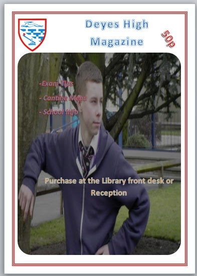

Here I have designed a mock front page cover and contents page for a college magazine. I have included a medium-shot photograph which I took myself and have also included the Deyes High Badge, a "50p" price tag and have used the simple masthead of "Deyes High Magazine". I have also created a mock contents page layout for a school magazine.
Monday, 7 February 2011
Nme front cover analysis

I have done an in depth analysis of Kasabians Nme front cover. I have discussed the colour scheme, the different fonts used, the main picture and the semiotics.
Mock Contents Page

Tuesday, 1 February 2011
First Blog entry
My name is Alex. I am studying A Level Media at Deyes High School. Here I will be uploading blogs, updates and videos. The posts and blogs include an analysis of two different music front covers, two contents pages and two double page spreads. I will then do an analysis of a college magazine including, a college magazine front cover and one college contents mock up. I will then justify the choices I have made
Thursday, 27 January 2011
Deyes High School Charter of Values
- Commitment
- Kindness
- A forgiving attitude
- Value and respect for all people
- Trust
- To be responsible for your own actions
- Enthusiasm
- Honesty
- Co-operation
- Respect other people's property
- Fairness
Subscribe to:
Comments (Atom)