Thursday, 24 February 2011
Double page spread 2
Here is my second analysis of an NME double page spread. I have again analysed the different features including the house style used. I have also talked about what colours and different text styles are used.
Wednesday, 23 February 2011
NME Contents page analysis
This is a contents page analysis from a NME magazine. I have done an in depth analysis talking about the house style used, the different colours used, the different fonts and how these make people interested in the magazine.
Sunday, 20 February 2011
Eminem Nme front cover analysis
Here I have analysed a second Nme front cover, this time the theme for the magazine is music festivals. I have done an in depth analysis of the different pictures, titles, colours and semiotics used to portray this theme.
Wednesday, 9 February 2011
Semiotics.
Semiotics, or semiology, is the study of signs, symbols and signification. Examples of semiotics are, the blue "f" internet icon for facebook or the "w" for wikipedia. An example of semiotics used in music magazines is the red "Q" that always appears on the front cover of Q magazine. This particular icon has never been changed and the distinctive red colouring makes people associate the red "Q" with Q magazine.
Moodboard
This is a moodboard of my favourite artists. Artists include, Kasabian, Eminem, Arctic Monkeys, The Beatles, Nirvana and others. Genres include, indie rock, rock and hip hop/rap. I will be using this when makiing my decision on what genre my music magazine will be based on. I will choose between one of these genres shown above before making my front cover.
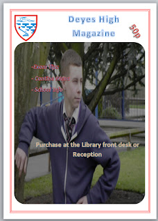
Mock College magazine
Here I have designed a mock front page cover and contents page for a college magazine. I have included a medium-shot photograph which I took myself and have also included the Deyes High Badge, a "50p" price tag and have used the simple masthead of "Deyes High Magazine". I have also created a mock contents page layout for a school magazine.
Monday, 7 February 2011
Nme front cover analysis
I have done an in depth analysis of Kasabians Nme front cover. I have discussed the colour scheme, the different fonts used, the main picture and the semiotics.
Mock Contents Page
Here I have designed a basic outline of what a contents page for my mock college magazine will look like.
Tuesday, 1 February 2011
First Blog entry
My name is Alex. I am studying A Level Media at Deyes High School. Here I will be uploading blogs, updates and videos. The posts and blogs include an analysis of two different music front covers, two contents pages and two double page spreads. I will then do an analysis of a college magazine including, a college magazine front cover and one college contents mock up. I will then justify the choices I have made
Subscribe to:
Comments (Atom)


